
The exhibition, titled Unexpected Art: Surface design inspired by museum collections, features garments made from fabrics printed with motifs taken from a few museum objects selected by the artist. Each work is accompanied by a paper plaque with the image of a fancy frame, showing a photo of the original object when it was from one of the other two museums, and the artist's statement about it. For objects from HHM, the actual item was displayed alongside the creation it inspired.
 |
| The above is all paper, it just looks like a fancy frame enclosing a plaque. |
Rahn made the motifs into surface design patterns, digitally printed those on fabric, then used the fabric to make garments she designed. The garment designs, as well as the motifs printed on the fabric, reflected Rahn's response to the selected object.
 |
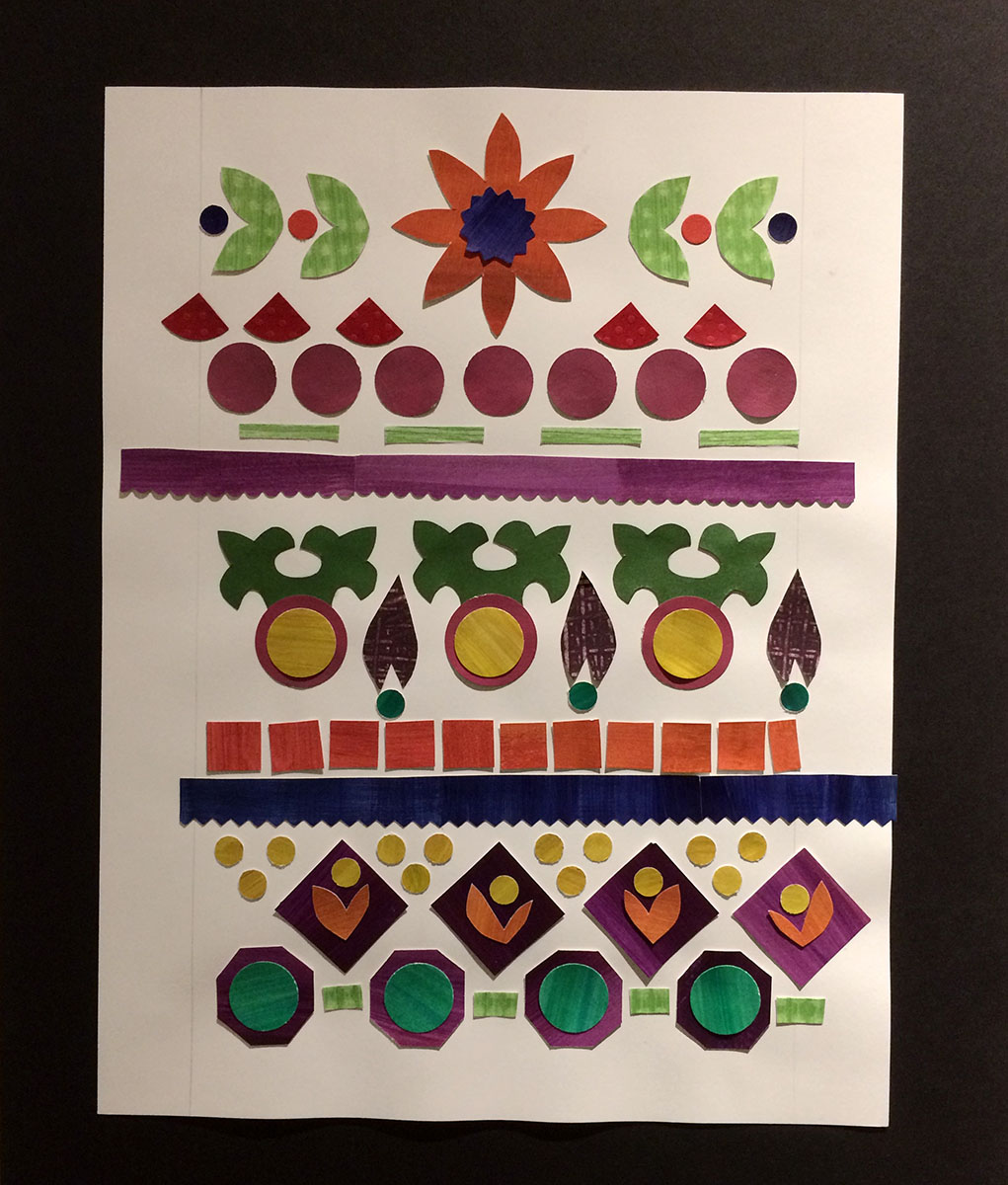
| The paint palette of portrait artist Frances Cranmer Greenman, in the collection of the Hennepin History Museum |
 |
| Dress inspired by Greenman's palette, with a scan of a portion of the palette providing the pattern for the colorful skirt panels. |
It's possible that the polyester was better for printing on with an inkjet printer, which is what she said she used. But on a table displaying printed fabric samples, there were a few squares of cotton, and it looked like they took the ink very nicely. Despite that minor disappointment, I really enjoyed the exhibition and was inspired by it.

I especially appreciated one she called "Glimmer of Green," where she used security envelopes to make paper collages inspired by a semi-surreal painting from TMORA by a dissident artist in the Soviet era, showing a small-town cathedral in Russia, which then became the pattern motif for a fabric that she made into a top.

As she states, the security envelopes relate to the idea that this painting, as well as others that did not conform to official standards, was hidden, secretive.
 |
| Paper collages made with security envelopes and other papers, inspired by the painting Uspenski Cathedral in a Village from the Museum of Russian Art |
The collages themselves could have stood alone as finished artworks, except it appeared that such was not her intention; some of the pieces showed signs of coming detached from the background, and they were not coated or finished.

I'm only showing you a very small sample of the works included and I do encourage you to see the rest of them up close and personal, which is quite possible in an intimate setting such as HHM, relying as they do on "Please do not touch" signs rather than barriers, so you can get really close to the works and related artifacts to examine them in detail.

In the second room, there was a board displaying a lot of doorknobs, some of which had labels identifying which buildings they came from, but most without any identifying labels.
 |
| Detail of some of the doorknobs at HHM. The one on the right is featured in part on the exhibition postcard. |
It's clearly an old object in the museum's collection of Minneapolis artifacts, and I don't recall seeing it on display before.

It's really quite a delight in itself, and I don't recall what she made from these motifs, other than the postcard for the exhibition, and a zippered pouch for sale in the museum shop. Although some of the doorknob motifs may have made their way into this collage, which became another patterned fabric.
After leaving the museum I was walking up the street with my friend Ann, on our way to meet other friends at the Boiler Room coffee shop. As I was admiring the old apartment buildings we passed along the way, Ann commented on the architectural detail in the building facades.
We were both experiencing a renewed awareness of and appreciation for the surface design and motifs all around us, inspired by the explorations of this particular artist.
Unexpected Art is on display through April 30 at the Hennepin History Museum, 2303 Third Ave. S., Minneapolis 55404.
Hi Sharon! What a lovely commentary on the exhibition. I hope you don't mind that I am commenting, but I was sad that you were distracted by fiber content and I wonder if I hadn't included that detail in the didactic labels if it would have bothered you. There is honestly no comparison on the print quality/richness of poly vs cotton. I chose the fabrics very deliberately. Cottons often appear washed out and muddy and although the swatches were fine, if you saw them side-by-side with the same design printed on another fabric, the difference would be striking. There are very few cotton fabrics available for digital printing (the technical challenges of printing on cotton are daunting) and a quilting weight cotton or canvas upholstery fabric is a totally inappropriate fabric for a garment. I understand your bias against polyester, but I absolutely don't share it.
ReplyDeleteBecka Rahn, artist
Thank you so much for your comment and for explaining about your reason for choosing the polyester; it makes perfect sense that it would be a very different printing surface than cotton, or other natural fibers. I can imagine that other cellulose fibers, like linen or rayon, would also be too absorbent for such purpose, and silk is likely far too expensive. I do know a few artists who paint on silk, but I have no idea how it would handle digital printing. My strong preference for natural fibers developed over my 20+ years of working as a seamstress and tailor, for what I came to see as their superior handling and finishing qualities; and yes, I would have ID'd the fiber without being told what it was. But I do get what you're saying, and of course you were quite intentional in choosing your materials. I apologize for implying otherwise.
DeleteThe issue with silk and digital printing is that is completely changes the hand of the fabric. Because it is a surface treatment, it tends to make the fabric stiff and crispy. Fine for some purposes, but you couldn't digitally print a charmeuse and have it be the same fabric in the end at all. Painting on silk is a dye-based process and so is commercially printed quilting cotton. That's a totally different chemical reaction than a pigment-process, which is what I use when digital printing. Printing on cotton, rayon and other plant fibers (and silk) isn't so much about absorption as it is about getting the chemistry right for the fabrics to bond with the pigments without changing the hand. We've all had t-shirts with plastic-y feeling silk screened graphics. No one wants their cotton to feel like that and also you don't want the color to wash out the first time it touches water. So it's a fine art to getting print quality and fabric quality to work together. Printing polys is a different chemical process where that chemical bonding is much easier to accomplish. That's probably more information than you ever wanted, but I have really enjoyed the conversation. :)
ReplyDeleteThank you! I've learned a lot today, and so will others who read this.
Delete