Showing posts with label useful calendar. Show all posts

Monday, December 23, 2024

In Search of an Ideal Planner, Part I

Years ago when Etsy was a community of makers and the admin staff was encouraged to foster friendly relations with them, they would host little in-person gatherings in the cities and towns where employees travelled to visit family at the end of the year. They called these meetups Home for the Holidays, and Etsy shop keepers could register to attend if there was one in your locale. 

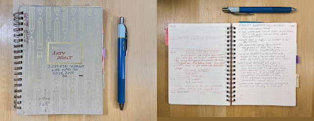
The one I remember was in December 2012, and I can recall the year because they gave out nifty little planner notebooks to all who attended.


I thought it was the neatest thing. I wrote my shop name on the front and used it for all kinds of notes, plans, stats, and analysis pertaining to my Etsy shop for a few years. I entered sales and views numbers, and tracked how my business was growing year over year on the platform. Looking back on it now, 12 years and immense growth and countless administrative changes at Etsy later (including new owners and becoming a publicly traded business), I am reminded of how different the experience of being an Etsy maker-seller is now, and how much my sales have declined since then. 

But I just wanted to say that I never got another planner from them, which is why I kept using it for 3 or more years. In fact, I've not seen another planner quite like it anywhere and that's what led me to start tinkering with making my own.

What I liked about it was its compact size (5"w x 6.5"h), spiral binding, and simple, flexible design. Each month opened on a two-page spread with holidays noted, followed by weekly pages that had the days on one side and a facing page that was finely gridded, so you could use it however you wanted. That's why I could keep notes and stats and sometimes sketch product design ideas for a few years.

As a very small-time operator and completely hands-on maker, I set out to design a planner that I could print at home and make myself from start to finish. That meant the size had to work with letter-size paper, to avoid excessive trimming and waste, so I made the pages 4.25"w x 5.5"h to print four on each side of a sheet on my Canon laser printer, which will print two-sided automatically. 


At first I would make only one, beginning in 2015. I was just focused on the logistics of making it and figuring what kind of hand-sewn binding I wanted to use. I experimented and played around with them for a few years, always just making a test document for myself. 


When I finally made a few to sell, in 2019 (for 2020) I used a through-the-spine criss-cross type of binding, which was a little complicated to execute, but allowed the book to open fully and lay flat for ease of use. It was a slim volume and probably contained too much information and not enough space for writing. My records indicate that I sold three of them.

(It was the Year of the Rat, hence the rodent theme.)


By the most recent version, for 2024 (Year of the Dragon), I had pared down the extra information and added more pages for user notes, increased the page count to 128, and assembled it with the same criss-cross binding through the spine, but with more signatures, which was a bit fussy to execute.


Well, earlier this year (2024), I learned of a printer near me, Smart Set, that was popular with a few artists I knew, employed eco-friendly practices (recycled papers, plant-based toner), is a certified B corporation and a union shop. I had been reluctant to consider using an outside printer, but these guys ticked all the boxes for me. 

Still, one of the reasons for my hesitation is that I am not a pro graphic designer and I was pretty sure that the way I set up my documents to print at home would not translate well to a print shop. The calendar itself, in two formats, required only moderate changes in how I set up the documents, and they printed beautifully. 

But the planner was more complicated: It would take quite a bit of time for me to create the document on my computer, which needed to be very different from how I had done it before, and it would cost quite a bit more than printing the calendars. I checked my previous year's sales records — about a dozen of them sold, some only after they were discounted — and I realized I just couldn't do it. 

Frankly, it was a relief to just pull the plug on that. But my husband and a handful of others had really liked my little planner, and I still wanted something small and flexible for my own use. So I began looking for a planner that met my criteria, and while I did find something that will serve for 2025, the search has renewed my urge to design my own. Now that I have a good idea of what's involved, including the cost, I just might have another go at it for 2026.

In the meantime, here's what I found and recommend in Planners Part II. 
Thursday, September 12, 2024

Moving Along to September Things


I could say that I've been busy with gardening, road-tripping, and doing creative things since I last posted anything here (in April), which is mostly true except the "busy" part. My aversion to being busy is the reason I did not keep at the 100 Day Project for the full 100 days. It got to feeling like an obligation, especially trying to do regular blog posts about it — there's nothing quite like obligatory creativity to sap my creative energy. 

Plus, it was time to turn my attention to my biggest creative commitment: making the Useful Calendar, which I feel the need to start working on in the spring. I begin by going through my 24-page Word document called "Holidays by Topic," updating all the ones that change, reviewing notes and websites with information about most of the holidays, and learning more about some of them as I go, because that's one of the things that distinguishes this calendar—the information it contains. I also dig in to researching the Chinese zodiac animal that will be featured. If you'd like to know the story behind the Useful Calendar and how it came to be, see this page.

It's not that all that preparation is a full-time job for months on end, it's that I prefer to work on it at a reasonable pace (see above about being "busy"), especially studying the animal, which has become an enjoyable journey of discovery for me, and creating 12 different illustrations.

I confess that I almost decided to put an end to featuring the zodiac animal when I realized that 2025 is the year of the snake. Like far too many people, I did not have warm feelings for those slithering animals. But with a little encouragement from my husband, I began by looking for natural history resources about them, and came upon a memoir, Saving Snakes, by naturalist Nicolette L. Cagle. Her sympathy and affection for them soon won me over and persuaded me that these maligned and misunderstood animals were worthy of my time and attention. 

Perhaps the illustrations and captions in my calendar, and whatever zines I manage to spin off from this project, can persuade some people to grant them a little respect and sympathy, as I have learned to do.

Plus, there is so much mythology, folklore, and history about snakes, full of intrigue and metaphor, comprising a rich tapestry of traditions I never knew about. Hello, all you snake gods and goddesses! I see you now.

Although I have begun doing the illustrations earlier than previous years, I have still let that part fall toward the end of the process, which means I end up feeling a little too rushed during the most creative phase of this project, which really does annoy me. And I have no one but myself to blame!

So I'm thinking that maybe next year I will sign on to the 100 Day Project again, only this time my "project" will be to focus on learning about, sketching, and making the illustrations for the next Useful Calendar, which for 2026 is the year of the horse.

At least, right now, that seems like a good idea.


Monday, March 11, 2019

It's a calendar, it's a zine, it's a diary — It's the Useful Calendar Almanac!

Yeah, I know. I'm writing about my 2019 almanac in March of 2019. What?


I actually finished the thing in January, and stitched together a prototype, which I marked up with corrections and notes, and then decided to use that one myself rather than discard it. Then I made a second one for my husband, who was missing his old-style printed calendar-planner. It's the size of a quarter of a letter-size sheet of paper, 4-1/4 by 5-1/2 inches, a nice handbook size that's also manageable for me to print and assemble at home.


Then I ran into a friend at the coffee shop, and when I showed him my copy he immediately said he would like one, so I made a few more to display during a neighborhood art event in February, the LoLa Winter Fine Art Exhibition, and he bought one, and the remaining 5 copies are now available in my Etsy shop. 


The truth is, this has been about four years in the making. Since 2015, I have made some version of an almanac-diary for my own use and as prototypes, always finishing them after the first of the year and telling myself I will make the next one in time to sell in the fall for the following year. These prototypes had limited text, since I didn't want to research and write articles, lists, and such for myself only.


But as I have modified the design of the Useful Calendar to allow more room for art, and to keep the font a readable size, and still keep it small and pocket-sized, I have left out more and more of the fascinating tidbits of information I gather along the way, and I really wanted to make them available in some complementary format, for which an almanac seems just the thing. And then it just made sense to have a few pages for a person to jot their own notes of whatever sort, whether using it as a planner or diary or phenology journal. So I added three lightly gridded pages per month.


This time I was determined to just get it out there, no matter the poor timing, and set the precedent that there will now be a Useful Calendar Almanac every year, alongside my usual compact-yet-informative calendar formats.

But I'm also equally determined to do all of it myself, from the research and writing, to illustrating, to printing and assembling and stitching. Because that's just how I do things, inefficient though it is. The following photos show the steps in the assembly process. Each one takes me about an hour to assemble, so I find something interesting to listen to and just immerse myself in the doing.

The cover, printed on card-stock, about to be cut and scored for folding


The flap to the left will form a pocket, because I gotta have a pocket.

Here are the pages, to be folded into signatures to form the text block.

Marking the signatures for where I will punch the sewing holes. The cover has the holes printed on it, so I punched those first and then use them as the guides for marking the holes in the signatures, because I will be sewing through the spine.

I chose some pretty-colored linen thread since the stitching will be both functional and decorative; the signatures will be sewn through the spine in a criss-cross pattern that forms X's on the outside. It means the center signature gets a bit more stitching than it would with a different style of stitch, because it is being sewn to the first and then again to the third signature in the process of stitching it all together. The result is a good securely bound book.

After all the sewing is done, I brush the spines with PVA glue, which remains flexible when set, so it will strengthen and protect the spine and the stitching. I brushed the glue over the edges, too, because I figure that's where the most wear will occur. They'll stay clamped like this overnight, after which the glued spine will still feel a bit tacky for a couple of days, but eventually it will just have a kind of rubbery feel.
I was going to offer these through my shop as a made-to-order item, but after I assembled a few and realized it takes about an hour just to do that, I thought I really can't ask what they're worth so late in the almanac season, so I am just offering the five that I've already made for $15 each, with a note in the description that the 2020 edition will cost $25 so as not to create the impression that $15 is a normal price for a hand-bound book like this. In truth, $25 isn't really a normal price either, but I do want to strike a balance between what I see as affordable and how much it's worth to me to make them. Because while I enjoy making them, I'd enjoy selling a few of them too.

Monday, April 23, 2018

Calendar design inspirations part 2

For years, I used to go to the annual Dayton's-Bachman's spring flower show at the Dayton's department store in downtown Minneapolis. It was an elaborate and fanciful exhibition of real flowers and topiary and whimsical statuary, set up in their large auditorium on the 8th floor for about one week in March. I would meet my mom and grandmother there, and later brought my two children at least a couple of times.

There would be a garden path that wound through the exhibition, revealing various vignettes following a theme. And it was all free — with a little gift shop at the end for buying garden-inspired products and a poster to commemorate the show.

In 1989 the theme was a book by Tomie dePaola, who designed the exhibition and created the poster. I was charmed and inspired by the airy whimsicality of it. I bought the poster that year and put it up on the wall in my kitchen, where it stayed until we moved nine years later. I don't know what happened to it after that; it may have been a bit tattered by then and we may have discarded it, or it's rolled up and stored in some forgotten spot.

I thought of that poster when I was playing around with design motifs and colors for the next Useful Calendar. As I mentioned in a previous post, I had settled on a theme of butterflies to illustrate the 2019 edition, and I was considering different fonts and a color scheme to go with that. Realizing that my usual tendency to make a bold blocky title is probably a bad match for the whole idea of butterflies, I started testing airier fonts and lighter colors.  

Another factor influencing my color choices was a catalog for The Company Store that was sitting on my desk as I was working on the design. My eye was drawn to the dusty pastel color palette of the quilt on the cover. It told me that, yes, muted colors can work.


So now that I'm pretty set on the color scheme, it's time to move on to trying different fonts, with a preliminary mock-up of the cover card to see how it looks once printed.


I do believe that design should follow function. I needed to see how well it all fits and looks on the cards. So I took the first four months of the current calendar, removed the artwork and used the space at top for notes about fonts I was trying out on that card.


I had one customer recently tell me that the text on this year's calendar is a little too small in spots. She was gracious enough to respond to my request for elaboration, and we determined that the text at the bottom of each card was the problem. Not only is it really tiny (8 pt), but I had set it in italics and the color blue. So I was feeling a little concerned about  going with my light airy scheme when I already had an issue with readability. 

At this point, I'm thinking that the solution will be to not only use a slightly bigger font, but to set most all of the text in black—and to use fewer words! 


I'll be turning my attention to the content now: checking the dates of the moveable holidays, and researching and writing the notes for the backs of the cards, which feature some less prominent holidays and interesting trivia.

I used to do all of the research and writing before starting on the design, but I have found that not only do I like doing the design work earlier in the process, but it also helps to then set it aside and ignore it for a while so that I come back to it with fresh eyes later on.

Which means that everything could change before it's done.