There would be a garden path that wound through the exhibition, revealing various vignettes following a theme. And it was all free — with a little gift shop at the end for buying garden-inspired products and a poster to commemorate the show.
In 1989 the theme was a book by Tomie dePaola, who designed the exhibition and created the poster. I was charmed and inspired by the airy whimsicality of it. I bought the poster that year and put it up on the wall in my kitchen, where it stayed until we moved nine years later. I don't know what happened to it after that; it may have been a bit tattered by then and we may have discarded it, or it's rolled up and stored in some forgotten spot.
I thought of that poster when I was playing around with design motifs and colors for the next Useful Calendar. As I mentioned in a previous post, I had settled on a theme of butterflies to illustrate the 2019 edition, and I was considering different fonts and a color scheme to go with that. Realizing that my usual tendency to make a bold blocky title is probably a bad match for the whole idea of butterflies, I started testing airier fonts and lighter colors.
Another factor influencing my color choices was a catalog for The Company Store that was sitting on my desk as I was working on the design. My eye was drawn to the dusty pastel color palette of the quilt on the cover. It told me that, yes, muted colors can work.
So now that I'm pretty set on the color scheme, it's time to move on to trying different fonts, with a preliminary mock-up of the cover card to see how it looks once printed.
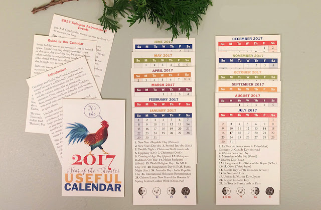
I had one customer recently tell me that the text on this year's calendar is a little too small in spots. She was gracious enough to respond to my request for elaboration, and we determined that the text at the bottom of each card was the problem. Not only is it really tiny (8 pt), but I had set it in italics and the color blue. So I was feeling a little concerned about going with my light airy scheme when I already had an issue with readability.
At this point, I'm thinking that the solution will be to not only use a slightly bigger font, but to set most all of the text in black—and to use fewer words!
I'll be turning my attention to the content now: checking the dates of the moveable holidays, and researching and writing the notes for the backs of the cards, which feature some less prominent holidays and interesting trivia.
I used to do all of the research and writing before starting on the design, but I have found that not only do I like doing the design work earlier in the process, but it also helps to then set it aside and ignore it for a while so that I come back to it with fresh eyes later on.
Which means that everything could change before it's done.


