Saturday, December 28, 2024

In Search of an Ideal Planner, Part II

When I decided to not make a planner this year, I started looking for alternatives that met the criteria I set for myself, inspired by one that Etsy gave out to its sellers years ago, as I related in my planners part one post, here.

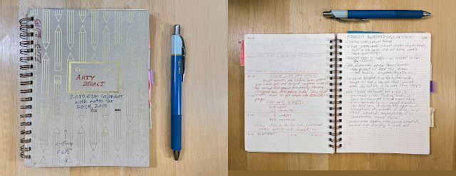
That is, I wanted a planner that is fairly small, with a simple unfussy format, and that's flexible in how you can use it, because I use it more as a log or record book than for planning. I want it to lay flat when opened so it's easy to write in or even keep open on your desk if you want to do that. 

Some of the ones that meet that criteria are undated, which, on the one hand, is nice because you could start it any time, and it certainly makes sense for the seller, because they never become obsolete! But it's not as useful to you and me because you need to consult a calendar to fill in the dates and note whichever holidays are relevant to you. 

In fact, when it occurred to me that if you have to fill in the calendar part of a planner yourself, you could use any notebook that is the size and quality you like, if you just had a printable version of a current calendar, such as the 2025 Useful Calendar, to paste or tape into it. So I made the medium size version of the desk calendar into a printable PDF for anyone who wants to do that.

Here's my very short list of planners you might want to consider, if you're still looking for a planner.


Field Notes

The undated 56-week planner by Field Notes is the one I bought for my husband, who will use it as a kind of log book.  

It has a sturdy chipboard cover, a spiral binding, and a nice clean design. It's the smallest of all those I found, at  4.75" x 7.5".  It's also very economical at $16.95.

It has only weekly spreads, no full month pages like most other planners. That seems like a drawback if you're looking ahead, but not a problem for a log book or diary.


Nuts and Bolts Paper Co.

I also ordered another one that's undated (on the inside) from a shop called Nuts and Bolts Paper Co., which is really about baby books and other mom stuff, but I was intrigued by the look of their planner, so I ordered one. The cover color choices were just mint or pink, and being more of an earth-tone kind of person, I wasn't crazy about either, but I ordered pink. The base price is $12; with the addition of pockets it came to $18.

It has the year on the front, as you can see, and a year-in-a-glance for the current and next year just inside (but without any holidays), and then the individual months and weeks, which are blank for you to fill in. You can also personalize it with a title or your name. Because I didn't know if or for what I would actually use it, I titled it "Random Miscellany." 

It's about 6" x 8", which is a little bigger than my ideal. The pages are a nice heavy text weight (70lb), and the back cover is a sturdy chipboard, plus the spiral binding is just big enough that it should accommodate a bit of added content (aka scrapbooking/mixed media/visual journaling).

You have several options with this one, such as choosing a month/week format (which I did) or a daily layout, whether to add an insert with pockets at the back (I chose that too), and some other choices. 

Honestly, I think I went for it because of the pockets and the attractive layout of the pages, which include various boxes with blank headings and others that could be renamed.  I may use it as a visual journal.

And maybe collage a little on the cover at some point.


Minnesota Weatherguide Environment Calendar 

This is the one I actually keep coming back to — the "engagement" version, in book form.

I love all the Minnesota nature photographs — one for each week — and all the weather and phenology information it contains. I use it to record household events, mostly, such as when the heat went out and when it was fixed, or when we had the plumbing upgraded, or that problem with ants in the kitchen and how we finally solved it. It has pages at the back for notes, which I use as an index, and other pages that I use like a scrapbook, to save funeral booklets and obits or other mementos. (I just tape or paste them on top of whatever content is printed there.)


Mementos pasted into the back of my 2023 Weatherguide calendar


An index in the back of my 2023 Weatherguide calendar.

Other planners that might work for you

I didn't buy any more planners to review, because, you know, I can only buy so many! But here are a couple more that looked appealing. Maybe one of them is just what you were looking for.

Favorite Story

This Etsy shop has a very nice basic planner, with natural brown chipboard covers, spiral binding, and a straightforward layout that doesn't add fussy trendy things like goal trackers and such. It's about 6" x 8", has major holidays noted on the month spreads, and  weekly pages that follow. There are two pockets as a folded insert (at the front), and a set of sticker tabs to apply yourself. The 178 pages includes 14 pages for notes. 

Frankly, this comes the closest to what I was looking for, other than being a little larger than I'd want, but I discovered it after I had bought the foregoing, and I wasn't going to buy any more of them! 

Fringe Studio

This company has several attractive planners, two of which are dated and the others undated. The covers feature lovely artwork and they appear to be well constructed, although I did not examine any of them "in person," so that's just a general impression. They come in a wide variety of types, covers, and sizes, with prices ranging from $15 to $40. Worth browsing through, anyway, even if only to look at all the cover designs.

... or there's always the DIY spreadsheet ... 

Finally, a confession: For actual planning, like to-do lists and weekly schedules and such, I use a spreadsheet on my computer. I note the weather forecast at the top because it affects whether I plan to go someplace by bicycle or stay home or drive somewhere, and since the weather is constantly changing, so are my plans. My to-do lists are often unrealistic, so I regularly copy-and-paste items to another day. I can color code the rows and boxes and then change them frequently, and I have a row or two across the bottom for vague sometime-in-the-future tasks that I don't want to completely forget about. 

Other than those future-task rows, all the entries are constantly changing and ephemeral, so if I want to note that I completed a given task, I write it down somewhere else, like in a planner/log book!

I made my weekly planner with the Numbers application that comes with Apple devices, which I can then access on my computer or iPad. But I'm sure you could do something like this in any spreadsheet program. (Another confession: the "House cleaning" row is purely aspirational. I rarely do any of the things.) 

Here's what it looks like as of today (in two screen shots): 


Good luck and happy planning in the new year!


Monday, December 23, 2024

In Search of an Ideal Planner, Part I

Years ago when Etsy was a community of makers and the admin staff was encouraged to foster friendly relations with them, they would host little in-person gatherings in the cities and towns where employees travelled to visit family at the end of the year. They called these meetups Home for the Holidays, and Etsy shop keepers could register to attend if there was one in your locale. 

The one I remember was in December 2012, and I can recall the year because they gave out nifty little planner notebooks to all who attended.


I thought it was the neatest thing. I wrote my shop name on the front and used it for all kinds of notes, plans, stats, and analysis pertaining to my Etsy shop for a few years. I entered sales and views numbers, and tracked how my business was growing year over year on the platform. Looking back on it now, 12 years and immense growth and countless administrative changes at Etsy later (including new owners and becoming a publicly traded business), I am reminded of how different the experience of being an Etsy maker-seller is now, and how much my sales have declined since then. 

But I just wanted to say that I never got another planner from them, which is why I kept using it for 3 or more years. In fact, I've not seen another planner quite like it anywhere and that's what led me to start tinkering with making my own.

What I liked about it was its compact size (5"w x 6.5"h), spiral binding, and simple, flexible design. Each month opened on a two-page spread with holidays noted, followed by weekly pages that had the days on one side and a facing page that was finely gridded, so you could use it however you wanted. That's why I could keep notes and stats and sometimes sketch product design ideas for a few years.

As a very small-time operator and completely hands-on maker, I set out to design a planner that I could print at home and make myself from start to finish. That meant the size had to work with letter-size paper, to avoid excessive trimming and waste, so I made the pages 4.25"w x 5.5"h to print four on each side of a sheet on my Canon laser printer, which will print two-sided automatically. 


At first I would make only one, beginning in 2015. I was just focused on the logistics of making it and figuring what kind of hand-sewn binding I wanted to use. I experimented and played around with them for a few years, always just making a test document for myself. 


When I finally made a few to sell, in 2019 (for 2020) I used a through-the-spine criss-cross type of binding, which was a little complicated to execute, but allowed the book to open fully and lay flat for ease of use. It was a slim volume and probably contained too much information and not enough space for writing. My records indicate that I sold three of them.

(It was the Year of the Rat, hence the rodent theme.)


By the most recent version, for 2024 (Year of the Dragon), I had pared down the extra information and added more pages for user notes, increased the page count to 128, and assembled it with the same criss-cross binding through the spine, but with more signatures, which was a bit fussy to execute.


Well, earlier this year (2024), I learned of a printer near me, Smart Set, that was popular with a few artists I knew, employed eco-friendly practices (recycled papers, plant-based toner), is a certified B corporation and a union shop. I had been reluctant to consider using an outside printer, but these guys ticked all the boxes for me. 

Still, one of the reasons for my hesitation is that I am not a pro graphic designer and I was pretty sure that the way I set up my documents to print at home would not translate well to a print shop. The calendar itself, in two formats, required only moderate changes in how I set up the documents, and they printed beautifully. 

But the planner was more complicated: It would take quite a bit of time for me to create the document on my computer, which needed to be very different from how I had done it before, and it would cost quite a bit more than printing the calendars. I checked my previous year's sales records — about a dozen of them sold, some only after they were discounted — and I realized I just couldn't do it. 

Frankly, it was a relief to just pull the plug on that. But my husband and a handful of others had really liked my little planner, and I still wanted something small and flexible for my own use. So I began looking for a planner that met my criteria, and while I did find something that will serve for 2025, the search has renewed my urge to design my own. Now that I have a good idea of what's involved, including the cost, I just might have another go at it for 2026.

In the meantime, here's what I found and recommend in Planners Part II. 

Tuesday, September 24, 2024

Irish Snakes and a Saint in a Snit

 My illustrations for the 2025 Year of the Snake Useful Calendar are coming along gradually—although I have managed to complete about half of them so far. Here's a look at one.

For March, I wanted to depict Saint Patrick driving the snakes out of Ireland, which is, as you may know, total bunk. More on that below.

I looked at several classic depictions of the patron saint of Ireland, including some where he's pointing at some sorry-looking snakes cowering at his feet, but in my sympathy-for-the-snakes mindset, I kept imagining a defiant snake being banished by an authoritarian saint who had had it with their attitude. 

All of which made me think of the Queen of Hearts confronting Alice, who does not look cowed, as illustrated by John Tenniel, when the queen is pointing and yelling, "Off with her head!"

I imagined the saint getting similarly fed up with a sassy Irish snake and its impudence.

The fossil record shows that there never were any snakes in Ireland, and the story that Patrick drove them away first appeared in the 12th century, invented by an English monk named Jocelin of Furness, who also amplified earlier stories about how Patrick slayed Druids by invoking the power of God the Smiter, which had been invented by another hagiographer in the seventh century. Patrick, who lived in the fourth century, was literate and left behind his own story, known as his "Confessio," in which he does not mention Druids or snakes, but I guess that just wasn't exciting enough. 

So my sassy Irish snake is purely a figment of my imagination. But then, the snakes in the traditional depictions of Patrick driving them away can only be figments of those artists' imaginations, too. 

To some modern pagans, the "snakes" are a metaphor for the Druids who, they say, were driven underground or slaughtered by Patrick and his comrades. But there are so many problems with that, beginning with an absence of anything in the historical record associating Irish Druids with snakes either physically or symbolically. As described on the website Irish Central, Druids were more like scholars and keepers of oral tradition than occultists or magicians.

According to Irish Central, St. Patrick and other Christian clerics helped preserve the many oral traditions of the Druids by writing them down. It's because of them that we know anything about the laws, mythologies, and histories established long before Christianity showed up on the island. 

Which means that I am being unfair to the good and probably mild-mannered saint in my depiction of him. But why let a few historical facts get in the way of a good story, right? At least I'm being transparent about the alternative facts here! For more on what can be known about the actual history of St. Patrick and the Druids, read this blog (which cites sources) and this commentary (which calls on many of the same sources). 

"I've had it with your attitude!"


Thursday, September 12, 2024

Moving Along to September Things


I could say that I've been busy with gardening, road-tripping, and doing creative things since I last posted anything here (in April), which is mostly true except the "busy" part. My aversion to being busy is the reason I did not keep at the 100 Day Project for the full 100 days. It got to feeling like an obligation, especially trying to do regular blog posts about it — there's nothing quite like obligatory creativity to sap my creative energy. 

Plus, it was time to turn my attention to my biggest creative commitment: making the Useful Calendar, which I feel the need to start working on in the spring. I begin by going through my 24-page Word document called "Holidays by Topic," updating all the ones that change, reviewing notes and websites with information about most of the holidays, and learning more about some of them as I go, because that's one of the things that distinguishes this calendar—the information it contains. I also dig in to researching the Chinese zodiac animal that will be featured. If you'd like to know the story behind the Useful Calendar and how it came to be, see this page.

It's not that all that preparation is a full-time job for months on end, it's that I prefer to work on it at a reasonable pace (see above about being "busy"), especially studying the animal, which has become an enjoyable journey of discovery for me, and creating 12 different illustrations.

I confess that I almost decided to put an end to featuring the zodiac animal when I realized that 2025 is the year of the snake. Like far too many people, I did not have warm feelings for those slithering animals. But with a little encouragement from my husband, I began by looking for natural history resources about them, and came upon a memoir, Saving Snakes, by naturalist Nicolette L. Cagle. Her sympathy and affection for them soon won me over and persuaded me that these maligned and misunderstood animals were worthy of my time and attention. 

Perhaps the illustrations and captions in my calendar, and whatever zines I manage to spin off from this project, can persuade some people to grant them a little respect and sympathy, as I have learned to do.

Plus, there is so much mythology, folklore, and history about snakes, full of intrigue and metaphor, comprising a rich tapestry of traditions I never knew about. Hello, all you snake gods and goddesses! I see you now.

Although I have begun doing the illustrations earlier than previous years, I have still let that part fall toward the end of the process, which means I end up feeling a little too rushed during the most creative phase of this project, which really does annoy me. And I have no one but myself to blame!

So I'm thinking that maybe next year I will sign on to the 100 Day Project again, only this time my "project" will be to focus on learning about, sketching, and making the illustrations for the next Useful Calendar, which for 2026 is the year of the horse.

At least, right now, that seems like a good idea.


Tuesday, April 9, 2024

A Cloudy Eclipse Day, Watering Plants With Coffee, and More Pattern Paintings

We were supposed to get a 75 percent solar eclipse here in Minneapolis, but instead we got 100 percent clouds. Oh well, there's always the next one. In twenty years.

Cloudy, rainy days are good for having our afternoon coffee at home, a tradition we started in the Covid lock-down times and, having become accustomed to the ritual, still do from time to time. There's usually a little coffee left over, even after I've had my second cup, which I pour into my plant-watering pitchers (one of which is an old coffee pot), to be mixed with water before pouring on the houseplants.

And that always makes me think of my Grandma Clausen (whose birthday was April 9!), because she used to pour her leftover coffee on her houseplants. She always had a lot of healthy plants, so I figured if Grandma did it, it must be good.

But one day I got curious and decided to do a little research on the practice. I wondered if anyone else did it, and if it was actually a good idea or a myth. As it turns out, it's a pretty common practice (see here and here), and may even be beneficial to plants, because coffee (and tea) contains some nitrogen and a couple of other minerals. But not all that much, so it's not really a substitute for using regular houseplant fertilizer. 

Both coffee and tea are also acidic, and that could be a problem if poured undiluted on houseplants that prefer a neutral to alkaline soil, so you probably want to look up your specific plants first. Since I usually have about a half cup of leftover coffee, and my watering pitchers hold about a quart, I figure my mixture is diluted enough to make little if any difference one way or the other. 

The really interesting thing about coffee and tea with regard to plants is the effect of caffeine, though. As early as 1911, researchers (link opens a PDF) were studying the effects of caffeine on seed germination, and found it to be allelopathic, which means it suppresses the germination of the seeds of other plants. So I nixed my plan to add the grounds to my seed-starting mix!

A more recent study on caffeine and seed germination (another PDF), concluded that it holds promise as an alternative to chemical pre-emergent herbicides. So maybe you want to be dumping your leftover coffee and tea on your lawn instead.

Meanwhile, My Art Practice . . .

I continue to loosely maintain my participation in the 100-Day Art Project, though in my case, it might more accurately be called a 14-week art project (=98 days), in that I don't really work on my art every day. But about midway through the week, I think about this blog and my self-imposed deadline to post something every week, and then I do a little dabbling with the paints.

At top is a cropped photo of a (shiny) gift bag, and beneath it a painting, using watercolor and gouache; size about 4 x 6.

For my 100-Day Project, which began Feb. 18 and has now reached the halfway point, I started out making mini collages, then moved on to spotting what I have called asemic patterns (in that they resemble writing in an abstract sort of way), taking photos of objects that suggest such patterns, and then interpreting them with watercolor paints. 

A scan of the inside of a security envelope, which had interesting flaws in its printed pattern. Beneath it is my watercolor background on top of which I plan to mimic the pattern.

This one's going to take a few sessions.

Another time (maybe next week), I'll elaborate a little more on the the practice of finding patterns all around us and making art from that, which I learned about in a workshop with Molly Anthony at our local art supply store, Wet Paint. But as this post already contains a bit of a rambler about coffee and plants, I won't add more words about that just now.


Tuesday, April 2, 2024

Fools and Delights


On some long-ago April Fools' Day, my mom baked cookies with a piece of cardboard inside them on which she had written "April Fools!" At least, I think she did that, mainly because I kind of recall my older siblings commenting that they became suspicious as soon as they learned she had baked cookies on April 1, because she so rarely made them.  

And I'm pretty sure I read about how our local zoo reported that they would receive calls on April 1 from unsuspecting people who had been left a note telling them to return a call from Mr. Lyon, with the zoo's phone number. 

I am not a prankster, mainly because I am incapable of keeping a straight face. But I am always curious about the origins and history of folk traditions such as April Fools' Day, and have read quite a few explanations, all lacking any supporting evidence (maybe they were all pranks?). What can be known about the day is summed up very nicely in this overview from the Library of Congress.


My 100-Day Project This Week

In truth, I did very little in the way of actually working on my project or projects, except to finish my scarf (watercolor) painting early in the week. See the beginnings of that one in last week's blog post (scroll down a bit to find it). I'm comfortable saying I'm done with it now. 

Some things I learned from doing this:

It really helps to allow a few days to do a painting, even a small one like this. It is too tempting to feel that I must complete a drawing or painting in one sitting, but it is nearly always a mistake to actually try to do so. 

The practical reason is to stop myself from overworking it while it's wet, which I've done often enough; the result tends to be muddy and opaque. But I also need to stop from overthinking it, and for that it helps to step away and go do something else, then come back to look at it with refreshed eyes. When I'm in the midst of it, I can't tell if I've done enough or already too much—and if it does need something more, what that might be. 

I don't have a plan for it other than to keep it in the box I am currently using for all things related to my 100-Day Project. And move on to doing another painting. And another one after that.

Books written for artists emphasize how you're supposed to produce a lot of work without worrying about if it's "good" or not. That's the only way to truly develop your skills—and to learn to relax and enjoy the process. It's the central message that I got from Lynda Barry's graphic memoir and creative guidebook, What It Is. The climax of the first half of the book is when she is agonizing about whether her work is any good, or is it crap? The right answer turns out to be, "I don't know."

That message is also central to the book Art and Fear, by David Bayles and Ted Orland.  "You make good work by (among other things) making lots of work that isn't very good ... ," they write.

And that's really what my "project" is, and the reason I signed up for the 100-Day Project. To push myself to just make pictures: drawings, paintings, collages, with asemic writing and without. 

Random Delights

I make frequent use of the Online Etymology Dictionary, or Etymonline. Its creator, Douglas Harper, posts random short entries on his Patreon page that show up in my email inbox at irregular intervals, with links to entries in his dictionary that often seem like non sequiturs, yet curiously do relate somehow, though I would be hard pressed to explain it. He doesn't fuss over syntax with these, either, so they often read like little bursts of thought that spring spontaneously from his brain. Here's an example from last week:

"unburst ordnance: The goal is to sow the landscape thick with landmines of delight. Little things, unexpected crocus in the sidewalk crack, that sort of. Never where you'd look for them. Someplace no one goes, or you get there lost and bleary looking for something else. That's when you'll want it there."

This little paragraph is followed by links to two words, Thompson and thisness. 

It made me think of The Book of Delights, by Ross Gay, a collection of essays about noticing the delightful things one might easily overlook when we are too focused on, well, whatever we're too focused on. And that reminded me that I have always meant to buy the book but hadn't done so yet. Since it was published in 2019, it's easy to find a used copy nowadays. (In fact, I just ordered it after writing the foregoing.)

Meanwhile, Over at Wordsmith, the Solar Eclipse

Wordsmith sends a word of the day Monday through Friday, with a theme for the week, which is sometimes topical. This week it's all about the upcoming solar eclipse (April 8) that will briefly cloak a wide swath of the country in daytime darkness next Monday. This Monday's word was "umbra." 


Tuesday, March 26, 2024

Coffee-Themed Artist Trading Cards and Etudes for Painting Practice

 On Friday, I met with my art exchange group to share and trade artist trading cards (ATCs) on the theme of coffee or tea. ATCs are art cards the same size as sports trading cards — 2.5" by 3.5" — made purely for fun and to be traded in convivial gatherings.  

Several of us chose to coffee-stain some watercolor paper as the substrate for either a collage or drawing/painting, with varying results. One person immersed the paper in a strong solution of instant coffee, adding extra granules for a grainy speckled effect; another dribbled the dregs from her drip coffee pot on the paper over a period of several days, plus setting the cup on it to form coffee rings like on a coaster—a variation of which two others employed. I had covered my paper with used paper coffee filters, immersed it in water, and added coffee grounds to the mix, expecting it to produce a splotchy brown result. 

Five "coffee" ATCs and one with a tea party theme. The middle one features the Ojibwe word for coffee, which translates as "black medicine liquid," she noted on the back.

I was wrong. My method barely stained the paper at all. So I tore up the coffee filters and glued them onto the paper to completely cover it to make my background. Once the surface was no longer tacky, I placed it under a stack of encyclopedias overnight to flatten it, then cut it into ATCs.


I used a brown pen to write on the background, mostly listing the various kinds of espresso drinks and then just copying other text from the website where I got the espresso words. Though not truly asemic writing, since it consisted of regular words, it was effectively that because it was meant to just add some background patterns and not really to be read. 

I was going to make a collage/mosaic rendition of our stovetop espresso pot, but quickly realized that would be too fussy for such a small format, especially making seven of them! (There were seven participants, but one couldn't make it to the meeting.) So I altered my photo of the pot to make it more colorful and give it a grainy texture, printed it in multiples on plain paper, and used the pieces I had already cut to replace the handle and, except for the above example, the knob on top. 

Oh . . . never mind. I saved the pattern pieces, though, in case I wanted to try another time. Maybe slightly larger.

Painting Etudes

Last week I wrote about noticing what I called asemic patterns, that is, patterns on various objects that brought to mind asemic writing. I thought I would try a little painting and drawing of those patterns, using the photos I took as inspiration. It's very challenging for me to extrapolate something abstract from something concrete, so I figure it's a good thing to practice. 

I started with the photo of my scarf, because the colors and texture are very appealing to me. I had to keep reminding myself that I'm painting the pattern, not the scarf!

Laying down some base color — the pattern, not the scarf 

 
. . . and some texture marks 

I don't consider the painting to be finished, but I might decide that I'm finished with it and move on to painting one of the other photos. I also have to remind myself that this is a practice exercise, an etude, not something that has to look polished and complete. Then again, I am feeling an urge to work on it some more.

Speaking of practice, I did remember that I wanted to practice my fine brushwork also, in the way of lettering, so I copied some of the exercises in the Speedball Handbook (which I introduced a couple of weeks ago). I guess if the scarf painting is an etude, this is like playing scales. (In case you haven't guessed, I did play a musical instrument in my school days, from fifth grade through high school. It was a cello.)


On my work table

I got a "restock request" from my friends at the Minnesota Center for Book Arts shop this week, for more of some of the zines that I consign there. 

Mini zines, which I call my tea zines for short, in various stages of assembly

I do not keep much of an inventory of finished works ready to go, preferring instead to make them as I need them. In order to facilitate that process, I fashioned several boxes, generally cut down from larger ones that once held envelopes and other supplies, to house components of zines, sometimes partially assembled to streamline the process of finishing them. Making boxes and organizing my various zines and other projects appeals to me as much as making the actual things. Sometimes more so. (Which can become just another way to procrastinate!)

Some of my ducks. In a row.

Recent Reading Just in Time for Easter

I am always intrigued by new scholarship surrounding the history of the religion I grew up with (Christianity), and especially sincere attempts to learn about the historical Jesus and his earliest followers. Like most Christians (I'm assuming), I had always thought there was a pretty straightforward narrative from the days following the resurrection that Western Christians will be celebrating this Sunday (Orthodox churches observe Easter on May 5), to the fourth century actions that formalized the institution of the Church in Europe.

But the scholars say not so fast! There were diverse schools of thought, faith and ideas in those early centuries, a great deal of which was revealed in the Dead Sea Scrolls discovered around the middle of the 20th century. A new book by Catherine Nixey, Heresy: Jesus Christ and the Other Sons of God, examines the diverse narratives surrounding Christianity's murky beginnings. It's given a thorough and thoughtful review in the New Statesman that serves up a bounty of food for thought for anyone who wants to better understand the unauthorized versions of the Church's complicated origins. 

A Few Final Words for this Week

I'm switching my blog publishing day to Tuesday because Monday is a better day for me to work on it than the weekend. Next Tuesday I hope to have more little paintings of patterns to show you (see how I'm stating an intention here?), and I'll tell you about a book I just picked up from the library, called The History and Uncertain Future of Handwriting, by Anne Trubek

I had to return my library copy of Asemic: The Art of Writing, by Peter Schwenger, which I first mentioned in this blog post. I couldn't renew it because someone else had requested it (was that you, by any chance?), so I decided to buy my own copy from Alibris, a non-Amazon site that many independent booksellers use. In truth, I was having to resist the urge to write in the book anyway, which is often the case with nonfiction—I want to write in the margins and add my own entries to the index and such. But it's nice when I can borrow it from the library first, to see if it's something I really want to own. 


Monday, March 18, 2024

Seeing Asemic Patterns, Some St. Patrick's Day Observations, and an Oops

Happy day after St. Patrick's and day before the spring equinox! For many of the vegetables and flowers that gardeners like to start indoors here in Minnesota, now is the time to plant those seeds. Maybe that is the reason I tend to associate St. Patrick's Day with green growing things.

I have often started seeds of Dutch white clover indoors at the end of January in order to grow my own seasonal houseplant by March 17, since the plants sold in stores as "shamrocks" are really South American oxalis. It's one of my little pet peeves about how the day is marked, which I have written about in this 2017 blog post.

The other thing that bugs me a little — but just a little — is how the emblematic greenery is often depicted as a four-leaf clover, when the whole reason for its association with the good saint is the folklore claiming that he used the plant to teach his followers about the Holy Trinity. Never mind that there's no evidence whatsoever that he ever did that, it's just that it's so missing the point about shamrocks and St. Patrick's Day.

Patrick is the subject of a lot of historical misinformation, including in his own telling of his story, says historian Roy Flechner in his 2019 book, Saint Patrick Retold. Flechner argues that Patrick was never captured and enslaved, that he made up that story as a cover for his flight from inherited onerous duties as an imperial officer in Roman Britain. You can read a good overview and summary of the book on the publisher's page here, and an excellent review in the Irish Times here.

As to Patrick's own version of his story, known as The Confession of St. Patrick, you can read it for yourself on this website, and view facsimiles of the earliest versions known. The elegant Latin text makes me think of asemic writing: Both aesthetically pleasing and meaningless (to me). 


Seeing Asemic: Patterns Everywhere 
Image from Post, a blog of the Museum of
Modern Art

Because the Latin text has no meaning for me, my attention is drawn to its decorative form, the patterns created by its marks. While all asemic writing mimics the form of regular writing, some artists copy the form of printed works almost exactly.

For example, Argentinian artist Mirtha Dermisache (1942–2012) created "asemic versions of the daily newspaper, maintaining the layout, but substituting illegible characters," hence highlighting the patterns formed by the headlines and columns of text, wrote Peter Schwenger in the book I mentioned last week, Asemic: The Art of Writing. 


With that sort of thing on my mind this past week, I began noticing the text-like patterns in seemingly random things, like my scarf . . . 


and the seeds in a bell pepper . . . 


and my half empty latte.


My heightened awareness of patterns that resemble asemic writing got me to thinking about the tendency we humans have to not only see patterns, but to imbue them with meaning, as if they contain some message from the divine. You know, like, "Today I saw X and I believe that god/the universe was telling me something." An article I read some while back on the web journal Psyche nicely describes this phenomena, called apophenia.  


From Leiden Medievalist Blog

About that Latin Text

There is something about Latin text and other hand-lettered archaic languages that carries an air of mystery, don't you think? It evokes a magic spell or incantation, mainly because we don't understand it, and because that ancient script looks so fanciful and mysterious, especially if you've read any historical fiction set in medieval times. 

Both because I have read those kinds of historical mysteries, and because of all that asemic writing stuff echoing in my head, I pounced when I spotted a review of the book Textual Magic: Charms and Written Amulets in Medieval England, by Katherine Storm Hindley (Chicago, 2023). 


By "pounced" I mean I read the review, not that I bought the book. I'll wait for it to come out in paperback, or become available from my library. But the review by Tom Johnson in the London Review of Books provides an excellent overview. 

In medieval Christian Europe, the written word was highly venerated, from the opening lines in the Gospel of John to amulets made of text written on parchment believed to have the power to protect and otherwise benefit the one who holds it. Johnson describes these as a kind of "charm magic," that is, "words and rituals that invoked supernatural power, whether divine or arcane, in order to gain protection, medicine and secret knowledge." 

The kinds of things people wrote down included "holy verses, sacred names, symbols, runes and pure nonsense." If that last part doesn't describe asemic writing, I don't know what does.

Apparently, the more undecipherable the writing, the better its magical properties; so while Latin was the primary language of these charms, they also incorporated lots of  "Greek letters, Hebrew, runes and all kinds of luxuriant gibberish," plus "sham alphabets, pseudo-writing and non-signifying marks." 

Fittingly, the author traces the decline in use of these written charms to the rise in literacy. "As more people came to be able to read, . . . it became harder to maintain the idea that writing contained occult power." 

Now I am thinking about a new variation in my 100-Day Project: asemic amulets.


Department of Oops: Pi Day on The Useful Calendar Planner 

My husband discovered a mistake in my planner this week. He wondered why I had put the pi symbol on March 12. I quickly checked all versions of the calendar, and the planner is the only one with the misplaced pi, which would have happened after I copied the calendar grid from the desk version and placed it into the planner document, then dragged it across because the planner calendar spans a two-page spread. I didn't notice that pi was left behind in that motion. I would actually be a little surprised if I managed to make all versions of my calendars without any mistakes! I tell myself that it will please the people who enjoy catching other people's mistakes.

It also reminded me of a custom I was told about when I took a quilting class many years ago, that of the "humility block." Traditionally, quilters were supposed to deliberately include one block in their quilts that contained a mistake, because only God is perfect. I thought at the time that it was a convenient "rule," and  I was certain I wouldn't need to do it deliberately.

But apparently the "tradition" is nonsense, as related in this excellent blog called Willy Wonky Quilts. 


On My Work Table

It's all quiet in Sharon's Compendium-Etsyland now, but the week started out with a mini flurry of orders over the weekend. Well, three orders, actually, but two of them had multiple items that I needed to make, so that kept me busy through Thursday. 

While I welcome the business, I really do, I'm looking forward to getting back to playing at my asemic projects, both doing some painting and drawing of the patterns I photographed last week, and playing around with those amulet charms. I also have a meeting with my art exchange group on Friday, and I've been pondering how I might incorporate some asemic writing into my coffee-and-tea themed Artist Trading Cards for that. 

I'll show you what I come up with next week, as well as whatever asemic marks I manage to put on paper.


Monday, March 11, 2024

Flowers in the House, Asemic Musings, and Being Particular About Notebooks


I want to start this week with flowers in the house. 

Years ago, a florist and blogger who went by the moniker Flower Jane would initiate a monthly blog chain called Flowers in the House, in which she posted several photos of flower arrangements she had placed in different rooms, and invited other bloggers to share links to their own pages showing their flowers. Even though her arrangements were quite impressive, she never made anyone feel that their simple bouquets were any less delightful, and would visit and comment on every blog that participated. As an occasional participant, I always enjoyed visiting blogs from all over, admiring their flowers, commenting and receiving comments, and reveling in the conviviality of the whole exchange.  

I don't know what became of Flower Jane, she hasn't posted on her blog since 2016. I know people get tired of blogging, or burnt out, and it really has become kind of a quaint way of sharing yourself online anymore. Everyone is on Instagram, it seems, or TikTok or whatever. I have an Instagram account, and Facebook, and Pinterest, and I find them all both inspirational and a little overwhelming.

If you care to share your own photos on Instagram or wherever about the flowers in your house this week, please comment and share a link. I'd love to see them.

My 100-Day Project this Week: More Asemic Doodles, with a Brush

Last week I mentioned a book, Asemic: The Art of Writing, by Peter Schwenger, which I said I would be picking up from the library, and indeed I did. I've only just begun reading it, but I did find the answer to my burning question: Where did this term come from?

It seems that the word was borrowed into English in the 1980s from French linguistics, in which it described an unintended absence of meaning or sense, such as occurs with a typo. The word is derived from the Greek root "sema," meaning "sign," which gives us words like semaphore, semiotics and semantics. "Sign" here relates to "signify"— to convey meaning. Adding the prefix "a-" changes it to not signifying anything, not having meaning.

Schwenger attributes this coinage to two men he describes as visual poets, Tim Gaze and Jim Leftwich. (Here's an interesting interview with Gaze from 2009).

In my continued exploration of this art form, I decided to try working with a brush, in particular one called a liner brush, which is very thin and long and used for lettering as well as other things where a fine line is desired. I found a nice little six minute tutorial by Andy Jones that proved to be a fine introduction. (I used my watercolor paint instead of the acrylic paint thinned with water that he is promoting.) I combined practice and note-taking as I watched, and after. So I guess some of this is asemic, and some of it is semic.

I realized that what I'm looking to develop are the same skills used in hand lettering and calligraphy, and that I have a couple of nice resources about that already. One is a book that was my grandfather's (I know because he wrote his name in it). Published in 1922, Principles and Practice of Show-Card Writing is filled with elegant examples from that era.

The other is a relatively more recent paperback, the Speedball Textbook for Pen and Brush Lettering. Mine is the 20th edition, published in 1972. I may have bought it back then, or someone might have given it to me, I really don't remember, but I've hung on to it all these years and it was kind of fun taking another look at it this week. The current edition is the 25th.

Probably the most valuable thing I've learned from all of these is that you have to practice using a brush just as you would practice a musical instrument. The various brush strokes — asemic marks, really — are like playing scales and etudes. I don't know why I haven't thought about it that way before, but it's kind of freeing and revelatory to me. Who knew?

On My Work Table

I like notebooks, but not just any notebooks. I like them to be small and easy to take places, have attractive covers, be reasonably sturdy, have a pocket in the back, with gridded lines that are pretty faint so they offer guidelines but don't dominate, and that are sewn rather than stapled.

You can probably see how this would lead me to making my own notebooks, and being an artist with an Etsy shop, how I might decide to make a few extras and offer them for sale, in case there are others who like those same things and don't mind paying for handmade. I actually only make two of a given design in order to create a listing on Etsy, then offer them as made-to-order items, so I don't invest a lot of time and resources in multiples of something that I don't know if anybody will buy. If nobody does buy them, I'll use them eventually. Having said that, I will note that I have sold a few of these, from time to time.

Shown here are two of my mini notebooks (about 2.75" wide by 4.25" high), I also have some that are half letter size (5.5" wide by 8.5" high), which have numbered pages and a different style of pocket.

I make the notebooks and most of my zines with a pamphlet stitch, which is quite easy and gives a satisfying result, in my opinion. I then run a glue stick up and down the spine and smooth it with my finger to reinforce the stitching. 

In case you're interested, here's where to find the notebooks and zines in my Etsy shop.

Thanks for looking. Show me your flowers! (If you want to.)