Saturday, March 26, 2016

Saving more bees: How and why I'm rethinking mulch in my garden

For years I have been a member of the chorus of natural gardening advocates who tout the benefits of using mulch liberally to suppress weeds, maintain soil moisture, control disease by keeping dirt from splashing onto plant leaves, and keep soil-dwelling pests at bay.

Even better, I have said, is to put down layers and layers of newspapers to form a solid—but natural! decomposable!—barrier to really suppress the weeds for a full season or longer. 

Between the boxwoods: lots of mulch, and emerging crocuses

Then I learned about ground-nesting solitary bees. These gentle hardworking pollinators include several genera of wild bees, sometimes called digger bees or mining bees, and they need access to bare soil to excavate their nest tunnels. 

This 5-minute video from the University of Minnesota condenses an hour of effort by one such bee (genus Colletes), diligently working to move a couple of small wood chips out of her way and then digging a tunnel in a sheltered spot next to a rock. Imagine that bee laboring to move several wood chips out of the way and then encountering a thick barrier of newspapers—or worse, black plastic. Game over, little hapless bee.

The widespread use of mulch is a matter of real concern to bee advocates, like those at the UC Berkeley Urban Bee Lab, who call it "mulch madness"—and the use of black plastic weed barriers they dub BPI  for "black plastic insanity." (If you click on the link, you'll see a photo of a beautiful little green sweat bee,  genus Agapostemon, emerging from her underground nest.)

There's no reason to fear these gentle bees; they don't have a hive to protect, and it is very unlikely they will ever sting you. While the Cornell Department of Entomology says these bees will not sting unless handled, many species will even tolerate gentle handling, as the children of Sabin Elementary School in Portland, Oregon, will testify. Their playground is home to thousands of Andrena bees—the kids call them "tickle bees" and have adopted them as the school mascot.

A little patch of bare soil to the left—the beginning of a more bee-friendly garden

So what's a conscientious gardener to do?

Mulch less, mulch sparingly, mulch lightly—and don't replenish those bare spots that emerge as our old mulch breaks down or gets moved around. Plant groundcovers for living mulches that leave space for the bees. Get into the zen of pulling weeds once in a while. When we don't have the time or inclination to weed, we can focus on edging to give the perception of a neatly contained garden.  (Trust me on this—I have gotten compliments on a very weedy garden with tidy edges.)

And no more laying down of layers of newspapers—unless we want to shred them first, as researchers at the University of Ohio did to encourage ground-nesting squash bees, which they found to be more effective than honeybees at pollinating squash, pumpkins, gourds, and other related crops. They determined that a mulch of shredded newspapers and grass clippings was best at both keeping weeds down and supporting these valuable pollinators.

Other loose, lightweight mulches, such as leaves and the hulls of various types of nuts, are also good alternatives to wood chips and barriers. These are not only easy for the bees to work around, but they also get blown about by the wind, exposing a bit of soil here and there in the process, as found by the Xerces Society in their test fields in California.

Ground covers make attractive natural airy mulches. In one of my gardens, I planted periwinkle (Vinca minor) amongst the bulbs and perennials and a chokeberry (Aronia) shrub.  The periwinkle has spread and interwoven itself throughout the garden so that I really couldn't spread woodchips without burying it, so I stopped trying to mulch it, and have found that I only need to pull a few weeds from time to time.

Tulips emerging amid a very loose mulch of leaves, plant debris, and perwinkle

This garden is lightly mulched by happenstance with the leaves that fall on it, the debris from previous years' ferns, astilbe and other plants, and the periwinkle sprawling everywhere. I have come to appreciate the aesthetics of the variety of textures and shapes in this mix of light mulches and plants. And by mid June, the perennials hide most everything else anyway. 

Most importantly—for the bees especially—here and there, patches of bare soil have become exposed. And that's where I first noticed little bees hovering over the ground last spring, shortly after learning about them.

Another part of the same garden, with coral bells, emerging star of Bethlehem (Ornithogalum), more periwinkle, and a little bare soil, which you can see in the lower right 

I didn't plan it that way, but now I'll be looking to replicate that happy mix elsewhere in my yard.


Tuesday, February 16, 2016

I Made My Own Card Scoring Board and You Can Too


For cards to fold neatly, it helps to score them first. That is, you make an indentation with a dull blade, such as a bone folder, on the outside fold line. But whenever I tried to measure and mark the exact center of my cards, I found it very difficult to be precise enough. And it was awfully fussy.

Then someone told me I could get a Martha Stewart brand card-scoring board at Michael's, a kind of template and guide, which this someone (also a card maker) found to be very helpful for getting that precise scoring line.

I'm no fan of Martha Stewart, nor, to be honest, of shopping at Michael's. But once I got the idea in my head that I could use a template to guide my scoring, instead of measuring and marking each card, I thought maybe I could make my own. 

Sure enough, a piece of cardboard, a Sharpie, and a couple of rulers are all that's needed. Why two rulers? That's the key to getting the card placed precisely before scoring: I hold the wooden ruler ("Women Rulers") on edge against the cardboard to guide the placement of my card, then line the metal one up with the line I drew with a fine point Sharpie on the cardboard, and score it with a bone folder.

Sometimes, especially in winter when the air is so very dry, I still get a less-than-ideal folded edge. When that happens, I rub beeswax along the fold, followed by my finger.


Saturday, February 13, 2016

Make a Victorian Puzzle Purse for Valentine's Day


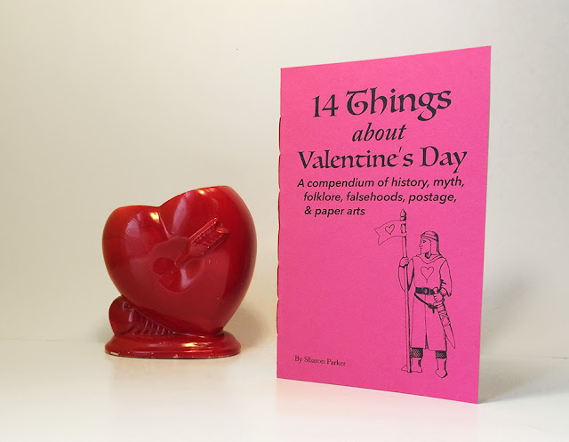
This is an excerpt from my chapbook 14 Things About Valentine's Day, pictured above.

This is the paper arts part mentioned in the subtitle. (From No. 14.)

How to Make a Puzzle Purse

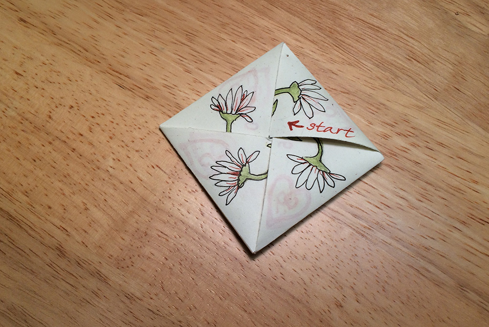
This is a folded paper package, sometimes called an origami puzzle purse, that predates the Victorian era, but was popular enough at that time to be commonly called a Victorian puzzle purse nowadays. Here's an example of one I made last year. (More views appear at the end.)


Start with a square piece of paper. It will be easiest if its dimensions are divisible by three. I cut my paper to 8.25 inches (2.75 x 3), which I chose because it is equal to 21 cm, so it divides by three no matter which measuring system you use. 


(1) Fold and crease diagonally, open, rotate, then repeat across the opposite way to form an X.
(2) Keeping the same side up, fold in thirds like a letter, crease; then rotate the paper 90 degrees and fold in thirds again, making 9 squares. Here’s where it’s helpful if the dimensions are a multiple of three—if you are not expertly precise with your letter folding, you can measure, mark, and score the fold lines first. 

That little square in the middle is going to be the focal point, and it will remain flat, despite the diagonal folds that pass through it. For now, put an X there with a pencil to help you keep track of what will be the inside of the finished packet.


(3) Turn the paper over (the penciled X face down) and make a diagonal crease in each of the squares that doesn’t have one yet (the center one along each side), starting with the one on the right side, by bringing the top horizontal crease of that square to meet its left vertical crease, and then creasing the diagonal within that square only, then opening it up again. Rotate the paper and fold and crease each of those center side squares in the same manner. The new creases are shown as dashed lines.

(4) Now turn over again (X side up), and here’s the part I find a little bit tricky: You’re going to pinch the corner diagonals as valley folds and twist the whole contraption counterclockwise to fold it into a pinwheel. At this point you may find that it doesn’t quite lie flat like it’s supposed to, so adjust your creases a little as needed to make it nice and flat.


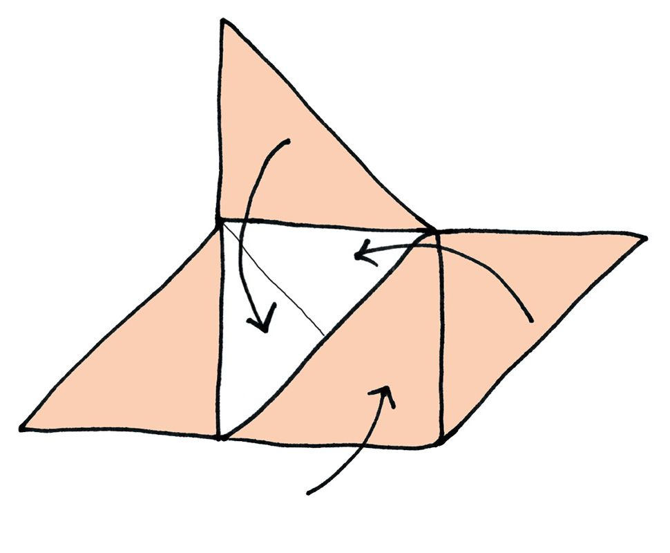
(5) Now take one point of the pinwheel and fold it in over the center, and then do the same with each point, working counterclockwise again, creasing as you go, and smooth it to make a nice flat square. 
(6) Tuck the last point into the first one.


And there you have it. You can draw pictures or rubber stamp images on it, and write messages (or a riddle) on the flaps to be read as it is opened.  Most people number the triangles (in a decorative way, of course) so that the recipient knows which one to pull open and read first. 


You might also add a little note on the last flap to be opened: “pull gently on opposite points to open fully.” Or something like that.


On the center square (where you penciled the X) you can write a message, or the end of your riddle (or a pictorial clue?), or create a mini collage, or place a square card or a smaller puzzle purse—just make sure that anything that you place or glue in the center is slightly smaller than the center square so that it will all fold flat. 


A basic search  for "victorian puzzle purse" via Google or on Pinterest will reveal lots of clever and beautiful ways people have embellished these over the years (as well as different instructions and tutorials, in case mine aren't working for you), from easy and simple to quite intricate, which are sure to give you some ideas for what to do with yours.


Sunday, December 13, 2015

Crafting a small portfolio to hold a set of cards, by the nerdy artist method

In order to live up to its name, my Useful Calendar has to be both informative and have a pleasing form. That means I spend about as much time researching and fact-checking it as I do on designing and creating it. And being the nerdy artist that I am, I enjoy both of these functions equally.

The 2016 Useful Calendar : a lot of info in a small format

This year I gave myself the design challenge to create a new holder for the calendar cards, because I changed the dimensions from trading card size (2.5" x 3.5" — 64 mm x 89 mm), to 1/8 US letter size (2.75" x 4.25" — 70 mm x 108 mm). This allows a wee bit more room for information and design, and also reduces the fussy trimming and waste, since the strips I cut away were too small to use for any other purpose.

This change required a new pocket to hold them. I used to make the pockets from assorted scrapbooking paper reinforced with packing tape. It made for a durable and reusable pocket, if a little funky looking: you could see the tape overlaps and serrated edges. But I wasn't interested in just making a larger version of the same thing. 

I decided to make something of a portfolio-style holder. I am not a professional package designer and I have no idea how they would go about designing this. So I drew instead upon my experience as a tailor and occasional dressmaker many years ago. 

When designing a dress, I would begin by draping the fabric on the client (I made a wedding dress modeled after a photo in a magazine this way once). If I wanted to make multiples of the design (I did not, in that case), I would then measure everything and transfer that information to a pattern.

"Draping" the cards with scratch paper to make a packet for them

So I began by "draping" my stack of calendar cards with a piece of scrap paper. I creased all the edges and then measured everything. I used those measurements to create a pattern in the Adobe software called InDesign.

A screenshot of my InDesign file of the card holders.  The light blue lines are guides based on the measurements of the folded scratch paper.

From there it's printing, scoring, cutting, creasing and folding; using an Exacto blade to cut a (curved) slit for tucking in the flap, and a corner rounding punch to, well, round the corners. 

The paper packets in various stages of production.

Since I decided to use a light gray 67 lb cover stock (a bit lighter weight than the cards, which are printed on 80 lb cover stock), I designed a cover to print on white labels. The label size that worked best for this was made for name badges, and, much to my delight, I managed to find a version from Avery that's entirely recycled and chlorine free. 

You can see more views of the cards (also printed on recycled cover stock, btw), and even buy them with their nifty paper packet, from my Etsy shop here.


You may have noticed a few bees in the photos above. The theme of the 2016 Useful Calendar is 12 wild bees. More information about that is provided on this page: About the Bees.  (Which you can also find in the upper right corner of any page on my blog.)

Friday, November 27, 2015

Everything looks better with a little snow on it

Even a much-neglected garden takes on new charm when graced with a coating of snow.


Like the red-twigged dogwood, which was made for this time of year. I love how the switchgrass, behind it, looks in winter too. I have seen juncos when there was lots of snow, hopping up to peck at those grass seeds, shaking many of them free in the process, and then eating them off of the surface of the snow.

I've also seen chickadees eating the seeds from old-fashioned garden phlox, which I never would have thought of as a wildlife-friendly plant.


Here's my one lone rose hip. A few had formed, but I only spotted one now.


And the crabapples, which will dwindle over the winter, as they feed the squirrels and robins and even, if we're lucky again this year, a flock of cedar waxwings.

I planted the dogwood in part so that I could gather my own twigs for decorative displays, and it is now plentiful enough to need pruning in the fall anyway. The crabapple also needs pruning, so I combined cuttings from those, plus a few sprigs of juniper and some black-eyed Susan, and took advantage of the recent thaw to push them into the two urns in the front. I wrapped the still-green ivy and other trailing plants around the bottom. I don't know how those will look when it gets cold enough to finish them off, but for now, anyway, I like it.


I also took the extra chance that Mother Nature gave me to get my 40 tulips and 40 daffodils all planted. With a generous mulch of leaves to cover them, they should be able to get in a little root growth before the ground freezes. Even more to look forward to in the spring!


Wednesday, October 7, 2015

Early October Garden Tour

Mums with licorice vine (Dichondra) and English ivy
I could say that I've been neglecting this blog because I've been busy taking care of my garden. But I haven't. Fortunately, my garden mostly thrives on benign neglect. Unfortunately, so do the weeds. (Blogs, on the other hand, don't seem to care one way or the other.)

Despite that, I've got some lovely things happening all around my neglected garden. Here are a few highlights, starting with the front.

The yellow-orange mums in the little concrete urn that sits atop the steps at the sidewalk have perked up nicely a day after I discovered them all droopy because I hadn't been watering them. (A hazard when you've had abundant rainfall all season -- you forget to water things when it stops!)

And now that the coralberry is starting to change color, I see that the leaves are a perfect match for the potted mum. I may have to move the pot to the other side so they don't get lost in the matching background, but I do rather like the hints of harmonious color at this stage.

Native coralberry (Symphoricarpos), with potted mums in the background

My hardy mums, planted in the ground near a dwarf Korean spruce, are a handsome bold red. Now there's some contrast for you.

Hardy mums in front of a dwarf spruce

Meanwhile in the backyard, the Prairie Fire crabapple is looking fabulous, and a few of the leaves are starting to turn, offering a hint of the show to come. The fruit generally lasts through the winter, depending on how hungry the squirrels are. A couple of years ago I had a delightful surprise when a flock of cedar waxwings filled the branches one spring afternoon and pretty much picked it clean. What a show that was! 

Prairie Fire flowering crabapple
Under this tree is a fairly large concrete birdbath, next to which I planted annual white salvia, which the bees have been enjoying this summer. 

Annual salvia, with lady's mantle in the upper left and the base of my birdbath in the upper right

And over in the corner by the garage and a "rocket" juniper, is the English lavender that has proven to be quite hardy in Minneapolis (USDA zone 4a). 


It even survived the polar vortex winter of a couple of years ago. We rake leaves on top of all the gardens but otherwise don't do anything extra to protect it. 

I've found that it's best to cut it back pretty severely in the spring and it'll send up lots of new growth. It starts blooming about midsummer and keeps going into fall. 


 This is Lavandula angustifolia, I'm pretty sure.


Over by the "kitchen garden," which is enclosed by a blue picket fence, are some bright marigolds mingling with the yarrow I transplanted to this spot after removing a diseased aster. I kind of figured that the disease, which looked like some sort of bacterial leaf spot, was in the soil in that spot, so I figured the yarrow and the marigold are unrelated enough to not be susceptible to the same disease. Neither appears to have been affected.


And when I was photographing the marigolds, I made the happy discovery of what I believe to be a sunflower bee (Svastra obliqua) -- it looks much like a large honeybee or small bumblebee, and is often mistaken for one or the other. But its size is in between those two, and its abdomen is more distinctly striped than the bumblebees that frequent my yard (Bombus impatiens, which have mostly black abdomens without stripes).

A closer look at the bee on the marigold

And just beyond that, the cosmos tumbling over the fence is hosting a Bombus impatiens.


Oh, and I mustn't forget the Henry Hudson roses, which are loving the cool fall weather. In fact, they retain a little more of the hint of pink now that the sun isn't shining so intensely on them.


And since I stopped deadheading it after early August, it has started to form the cherry red hips that Rugosa roses are known for. 


So there's your garden tour for early October. I'll take you on a little tour again later this fall  after the leaves are showier. 

And in the meantime, I'll have to get out and do some weeding, and planting --  I've got bulbs to plant! I ordered a whole bunch of them from John Scheeper's and they just arrived a few days ago. Time to get busy.

Tuesday, June 16, 2015

A wild rose is a welcome volunteer in my garden

 Last year, a mystery rose plant showed up in one of my gardens. It wasn't far from the last spot where I had transplanted my ill-fated Apothecary's rose (Rosa gallica officinalis), which had managed to produce a blossom or two before it died, and I thought had set hips (seed capsules). The mystery rose was also near the downspout where the local chipmunk often hides, and not far from the bird feeder. This combination of factors led me to wonder -- and hope -- that it was my Apothecary's rose come back, with a little help from some hungry critter. 

I transplanted the volunteer to a better spot and put a support around it and waited for blossoms to form so I could confirm its identity. Not surprisingly, it did not bloom in its first year. I did occasionally wonder if I was mistaken and perhaps it wasn't a rose at all, mainly because of an absence of thorns on much of the plant; but a closer look confirmed that it had thorns on the central stem, and I was sure that ruled out members of the pea family that might have similar-looking leaves.


So when several buds formed in early June this year, I was watching. When the first one opened up it was a pale pink single flower with just five petals. Apothecary's rose is described as semi-double, meaning it has more than five petals, and is a dark pink/light red color. This flower made me think of a wild rose, so I did a little research.

As it turns out, my volunteer is a native wild rose, Rosa blanda, called variously meadow rose, smooth wild rose (for its lack of thorns), and several regionally specific names like Hudson's Bay or Labrador rose, which may give you a sense of its hardiness. In fact, it is native to nearly all of northeastern North America.


Its sweet simple blossoms are very pollinator friendly, and seem to be especially popular with these hover flies, which are beneficial not only as pollinators, but also as predators of aphids and other soft-boded garden pests. I noticed a few different bees on the blossoms, as well.

And when it's done blooming, it's still an attractive ornamental plant, forming bright cherry red hips in late summer and colorful foliage in fall. The birds like the hips, and some people do, too, although I've never tried them. Perhaps this will be the year I try rose hip tea or jelly.


Thursday, May 14, 2015

The Useful Calendar Part 2: Dragons and Robbers

I wrote about the origins of the Useful Calendar, and why I call it that, in this post yesterday. Today I'll finish the story.

The Useful Calendar Goes International

Once I started selling the calendar on Etsy, I shifted from a hyper-local focus and made it into an international calendar. It now includes all US federal holidays and many international observances, as well as important holidays of the world’s major religions. 

Each year it seems that I discover some holiday or observance I haven't included before that I feel I should add, either because it's from a country that I see as on an equal footing with others I've chosen to include (if the Belgian National Day, why not the Swiss?), or because I find it to be a delightful occasion and think others will too (such as the Japanese Doll Festival). Depending on when these occur, I may drop something else to fit it in (July and August almost always have room; February and March are always crowded). 

2012: The Year of the Dragon and a Bigger Calendar

A few years ago, my husband suggested that I make the one-page poster version larger, so I made it tabloid-size (11 x 17 inches) in 2012. 

It was the year of the dragon, and with our own bankruptcy and foreclosure still fresh in my mind—stemming from the failure of the Observer in 2006— and knowing that so many others had been through a similar experience what with the recent real estate bust, I drew my dragon as a (mortgage) banker in a blue suit. It was sort of my own little inside joke.

The 2012 calendar—the year of the dragon—at twice the size of the 2011 edition


And since I had a little extra space in January, I added a quote from Patricia Wrede's book, Talking to Dragons: "Always be polite to dragons."

Design Innovations Spurred by a Robbery

My approach to designing these has been pretty much haphazard and jury-rigged, using Adobe's Illustrator program when InDesign is better suited to the task. But in 2012, when I was nearly finished with the 2013 edition, I got an opportunity to start fresh with an InDesign template created by my friend, Marsha Micek, a professional graphic designer. 

The impetus for this improvement was the theft of my computer (and my husband's) along with our backup drive in October 2012. I had to start all over again, including re-entering all of the data and text, at a point when I should have been printing it out for a craft show that weekend. I cancelled my part in the show and spent the next couple of weeks scrambling to reconstruct the calendar with Marsha's excellent (and patient) guidance, in order to get it ready for another craft show in early November.

The 2013 not-quite-so-useful calendar, with July starting a day late and ending a dollar short!


The new template worked great, but in my haste, and being more than a little flustered, I completely messed up the month of July, starting it a day late and giving it only 30 days (the second mistake kept me from screwing up the months that followed, however). My husband discovered the error a few months into the year. He thought it was amusing, but I was mortified. How can I call it the "useful" calendar when a mistake like that?


In this year, I stopped circling and naming the full moons and instead did some drawings of the moon phases to use across the bottom of each month. I did this to add another graphic element to the design, as well as to provide a little more moon phase information for those who were looking for that sort of thing.  


I obsessively checked and double-checked the 2014 edition, and discovered no embarrassing errors in that one, though I do recall some minor errors I found and fixed after I thought it was done.


After my daughter graduated from college and completed a 6-month internship at Experience Life magazine, I realized that I had access to a skilled proofreader, and asked her to read the 2015 edition. She was very thorough and caught some spelling irregularities and inconsistencies that had existed for a few years, plus my placing of Cinco de Mayo in March. I like to think I would have caught that one myself before printing it. 


I had been doing a few sketches of sheep for this year's calendar when I learned that some people called it the year of the goat. That led me to do a little more research, and some goat drawings, and to then work this dichotomy into the calendar design, along with a brief explanation about it, because, you know—Arty Didact. 

I wrote about the goat/sheep year confusion here earlier this year.

Calendrical Curiosities and Serendipities

Among the things I enjoy about creating this calendar each year are the serendipitous discoveries I make during the research phase, such as the Japanese Doll Festival that I mentioned above. So many of these holidays have interesting stories behind them that I wish I had room to say something more about them without sacrificing the functionality of the calendar.

A few years ago, I started putting notes on the backs of the cards to offer a little bit of explanation, especially for those holidays that I thought most of my audience would be unfamiliar with. Then I realized that the stories behind even familiar holidays are often forgotten, so I mixed it up a bit, changing some of the occasions for which I offer explanatory notes from one year to the next, and introducing some calendrical trivia where I had room (August, mostly). 

The 2015 calendar cards, showing the notes on the backs of March and September

This has become my way of sharing the serendipitous pleasure of learning something new and interesting as you make your way through the year.

Of course, these little trading-card size calendar pages don't allow for much in the way of telling the stories behind holidays, and so I have often thought about introducing a third version of the calendar that would be a sort of zine, or an almanac, with short informative articles about calendar-related topics. And while I'm at it, why not provide space for people's own notes, like a planner? I played around with a prototype of this last year, but didn't have time to develop it further.

And so now, while my updated list of dates and events for the 2016 Useful Calendar is in the hands of my capable fact-checker, I am in the process of developing the new Useful Calendar-planner-almanac. And playing around with what to call it. Because Useful Almanac sounds even sillier than Useful Calendar. On the other hand, there's branding. 

So my current working prototype (really a couple of prototypes, this journal made with scratch paper being one) has multiple names. Or maybe one name followed by an explanatory subtitle.

Stay tuned.


Wednesday, May 13, 2015

The Beginnings of the Useful Calendar. But, wait: Aren't All Calendars "Useful"?

I was getting ready to do a little show-and-tell about some design innovations I'm working on for the 2016 edition of the Useful Calendar, when it occurred to me that I should probably first give you a little background on this annual project of mine—the story behind it, and why I call it the "Useful Calendar."  It has changed quite a lot since I began it 10 years ago. 


The first Useful Calendar in 2006, and a few other early editions, on letter-size card stock (cartridge paper)

Introducing the Useful Calendar

I've been compiling the Useful Calendar since 2006, when it was a free promotional item for readers of the Minneapolis Observer, a monthly newspaper my husband and I used to publish. I had seen promotional calendars from other businesses, and felt that they weren't informative enough or convenient enough in format to be truly useful.

I included dates that I thought would affect planning, and put it all on one page, so that a person could glance at this calendar and quickly see not only the date of Easter, or day of the week for the 4th of July, but also major local events that can obstruct traffic and parking, and cultural events that a considerate person might want to know about so they don't plan a community potluck luncheon in the middle of Ramadan, for example.

At the same time, I did not want to clutter it with what I considered to be frivolous or promotional events, even those that promote worthy causes. So, no Coffee Day or cancer awareness, or even Black History Month. Because I wanted it to fit on a page and still be a readable font size.

And that's why I called it the Useful Calendar.


How a Calendar Led to an Etsy Shop 

Soon after I created the first Useful Calendar, the Observer went out of business. We then launched a much smaller publication called MOQ (Minneapolis Observer Quarterly), a literary zine about "exploring the bucolic city," and I continued to create the Useful Calendar under this new moniker and give it away to subscribers and others to promote the publication. Really, though, I made it because I found the calendar useful and I hoped others would too. It was too much work to create it only for myself.

In 2009, I also made it into a set of cards, because I really liked the idea of having a smaller, pocket-sized version of the calendar that I could keep in my purse. I made them the size of Artists' Trading Cards (ATCs, 2-1/2 x 3-1/2 inches), because I was into those at the time. I then designed and made a paper pocket to hold it, and laminated it with packing tape for durability. 


An assortment of pockets with the 2014 calendar cards
This innovation was, in truth, also all about me, and what I found useful and pleasing. But I truly hoped that others would think so, too.

So I launched an Etsy shop, which I called Arty Didact, reflecting the way I like to combine art and information (i.e., didactic art), the calendar being a primary example of that. I have steadily added many different products to my shop, to the point of it becoming rather too eclectic, but that's another story.


The 2011 version introduced the Chinese zodiac animal as a theme, and included a few planetary notes, plus made-up names for the full moon dates, which are circled.

When working on the 2011 edition, I was pondering what to illustrate the calendar with, when I hit upon the idea of using the Chinese zodiac animal. It was the year of the rabbit, and the drawing I did for that year's calendar soon became the iconic image for my Etsy shop.  

Just as selling the calendars led me to open an Etsy shop,  opening an Etsy shop changed who I was making the calendars for, which led to further changes in the focus and format.

Read the rest of the story here.


Friday, May 1, 2015

A fading tulip and a crying baby at Dogwood Coffee


I'm sitting at Dogwood Coffee on Lake Street admiring the fading orange tulip that's still standing tall exuding good-natured cheerfulness. A woman walks in holding a baby dressed in striped leggings and a brimmed hat, with a pacifier in its mouth that's not doing the job.

Unhappy baby is crying and fussing as Mom props him on her hip while standing at the counter. A man at a nearby table makes a face at the baby in an apparent attempt to cheer him up.

Baby screams and out drops the pacifier onto the floor.

Mom laughs as she picks up the pacifier and the man apologizes as the baby continues to cry loudly.

Mom explains that some people just set Baby off. Even her father has that affect.

Man offers to babysit some day. Mom laughs. Man laughs. Baby calms down.

Mom and now quiet baby go on their way.